This project I made for a 2019 art trade (Lem and Fero on High Sun Day) was the first time I used this method of character modeling, and I learned quite a bit in the process. Below are the steps I took (and what I’d do differently in the future) in the hopes that others can use this for their own work, or just gain insight into mine.
Why this Method?
I was inspired to take a stab at this process after seeing Mike Blackney’s tweet (embedded below) demonstrating how he’s created the characters for Dead Static Drive.
This method of modeling was often used in early 3D games to work around the tech limitations of the era. It allows for quick rigging and animation, and tends to work best with flat-shaded lighting (but it’s been done with other lighting methods too).
Step 1: Concepting
I knew my method and my subject, so I began by concepting the characters that would be the focus of my piece. Although I already use simple shapes in all of my work, this style is especially conducive with them as the seams of one mesh can easily be hidden inside another, and my flat-shaded textures would allow me to create sharp details. In this phase I’ll also concept the environment I’ll display the characters in (even a few details will go a long way to anchor them).
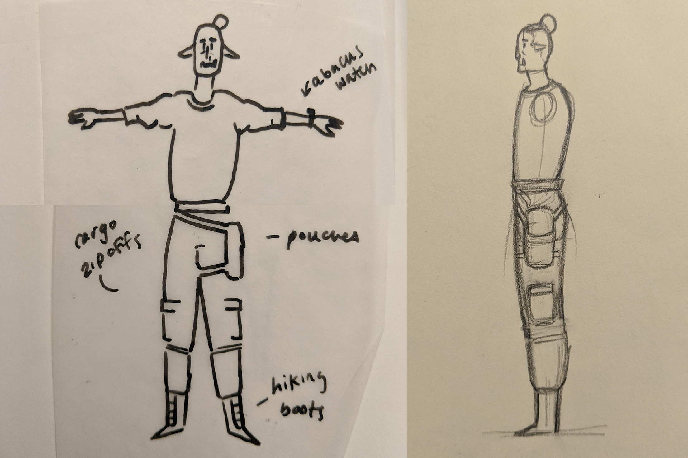
I like to use pen, sketchbook, and tracing paper to quickly iterate my designs and see different pieces mixed and matched together. I’ll also often jump into an image search to radically change up my designs.
First image: front and side concepts for Fero Feritas. Second image: front and side concepts for Lem King.
Step 2: Finalize designs
After I’ve settled on my designs, I bring the scans into photoshop and redraw them so that the front and side views align. This particular process works best for my brain, but others find that starting in photoshop, or skipping this polishing phase works best for them.
Step 3: mesh Block out
Next, I’ll bring my designs into Maya and start blocking out the forms. At this stage I try not to get too caught up in finessing any individual area; rather, I’ve found it’s ideal to get an idea of how the whole form will work in 3D space, as broader details tend to need some changing in the translation from 2D to 3D. This is also the stage in which I make sure that my planned level of detail will look right: I’ll splash the models with placeholder colors and check the various forms in a flat-shaded mode to make sure everything looks cohesive.
Step 4: Finesse
Once the majority of the form has been blocked out, it’s time to start working on the final details. This means pushing each model to it’s final level of detail, then modeling in any bits that will need to be textured differently. This can be seen in Fero’s pockets, where the added vertices don’t after the silhouette but are instead used to shift the hue and give the appearance of pockets. It’s also true of his holiday cactus sweater too; that entire design is modeled!
Throughout this phase, it’s important to move around the model, checking how each added detail works from different angles
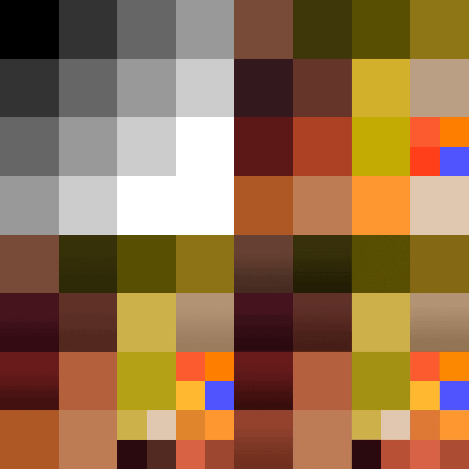
A quick history of the palette for this project, from grayscale to final colors.
Step 5: unwrap & texture
When the model is more or less complete, I’ll start working on a texture sheet. This project was always intended to be flat-shaded with sold colors and gradients. Often my first step is to create a grayscale grid - this helps me make sure I’m drawing the viewer’s eye the important bits, and not accidentally highlighting the unimportant. I like to save various versions of the texture sheet as I work for quick comparisons of different colors…plus it makes for a fun artifact when the project is complete.
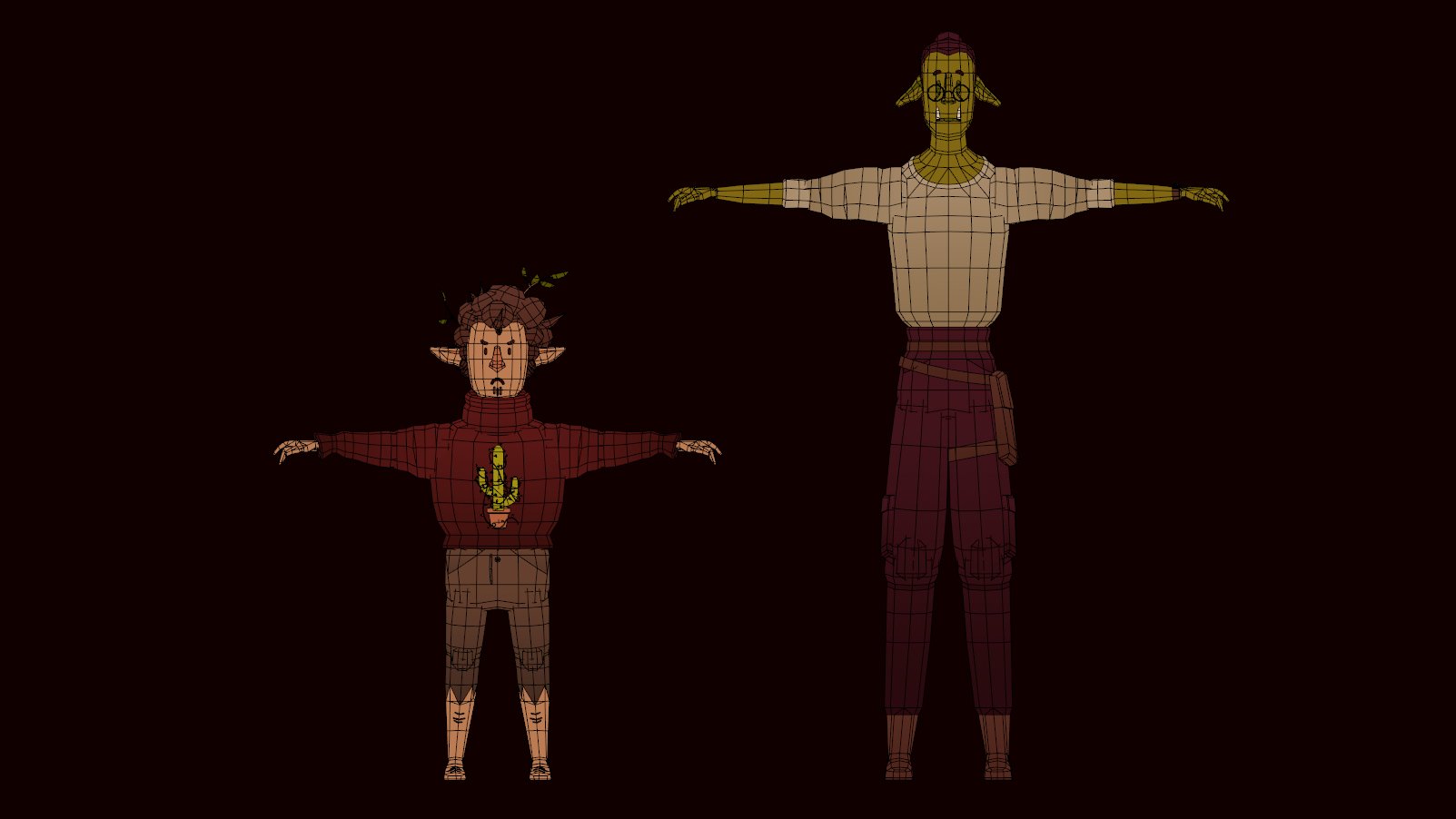
I’ll then create whole swaths of UVs by selecting an entire mesh (or a particular area) and taking a snapshot. The means the entire torso of each model is one, uncut mesh laid over itself. A touch messy, but very quick and has the proper final appearance. A downside to this particular method is that any details were you want the colors to differ (outside of a gradient) either takes of precious texture space or will need to be modeled in. As this wasn’t for a game and would solely exist as a digital artifact I went ahead and constructed the design of Fero’s sweater rather than paint it digitally. The same goes for the details on Lem’s face and ears, as well as the details on both characters’ pants.
Fero (left) and Lem (right) with final textures and wireframe.
Step 6: Rig
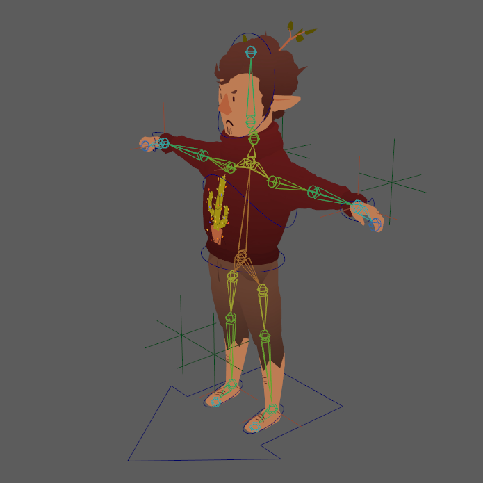
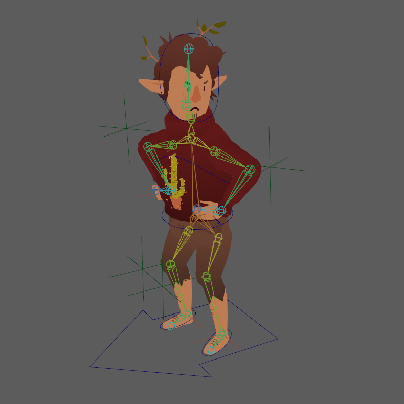
Finally, I implemented a basic bipedal rig: it included controls for the full body, each foot, the hips, torso, each hand, and the head. There was a single bone for each hand as this project didn’t necesitate the articulation of fingers. Lastly, the legs and arms each use IK with look targets for the knees and elbows to help fine tune the poses.
The weighting itself was black and white - literally! One big draw to this method of modeling characters is the simplicity it lends to the skin weight painting. Each chunk is modeled to overlap with the next, so depending on your needs most or all of the modeled chunks will be weighted to a single bone - the thigh mesh is skinned solely to the upper leg bone and so on.
Fero with rigging in T-pose.
Fero’s final pose.
Weighting on Fero’s torso.
Final Product and Lessons Learned
When I first showed this project to some colleagues, they immediately noticed the shoulders…or lack thereof. Without another round node to connect the torso to the upper arm, the characters look quite shoulderless, especially Lem in his final pose. If there’s one thing I’d change next go around, it would be to treat the shoulders as I did the elbows and knees, inserting an extra round mesh to maintain volume as the body articulates. The other takeaway is to get out of your head and show your work to a pal, they’ll often catch the obvious thing you’re too dialed in to see.
Second, while I had fun challenging myself to create all of the details out of mesh, it would really make the most sense to paint the texture for more complex details like Fero’s sweater design, even if it means using a larger or additional texture sheet.
The final scene, with a close up of each character.


